DataViz @ MQ
Unlock Your Data Storytelling Potential with the inaugural DataViz Challenge! 💪
Join us for DataViz, an exciting initiative from School of Mathematical & Physical Sciences of Macquarie University — a data visualisation challenge designed to showcase your ability to tackle real-world sustainability challenges through analytical thinking, creative visualisation, and compelling storytelling. You can participate individually or in teams of up to 5 students. The challenge is open to all current Macquarie University students.
Important dates 2026 🚨
| Monday 14 September | Challenge Launches |
| Sunday 27 September | Registration Deadline |
| Monday 28 September & Tuesday 29 September | Dashboard Masterclass |
| Monday 26 October, 9:00am (ADST) | Entry Deadline |
| Monday 2 November (Week 13) | All Winners Announced |
| Week 13, TBD | Showcase & Award Ceremony |
How to Enter 🎫
- Register at https://mqedu.qualtrics.com/jfe/form/SV_beVCqnZj7OR7V6S.
- This includes your RSVP to the Dashboard Masterclass.
- Complete your visualisation.
- DataViz participants will be added to dedicated community iLearn page for
DataViz 2026. You or your team can then submit the visualisation along with a short paragraph (max. 200 words) describing the story you intended to tell. We encourage you to be creative and showcase your insights! Submissions are due by Monday 26 October, 9:00am (ADST).
2026 Challenge
Using datasets suggested by the United Nations Datathon or any other publicly available datasets, create a static or interactive dashboard using ANY software or package you like (Quarto, Shiny, Power BI, Tableau, Excel are just few such examples) to tell a story or highlight key insights related to one of the following themes: - Food, including but not limited to security and nutrition; - Education.
Some sample dataset can be found here, using the Food and Education tags.
We have selected these themes for their relevance to the United Nations Sustainable Development Goals (UN SDGs). Food security and nutrition sit at the centre of Goal 2 (Zero Hunger) and connect closely to Goal 3 (Good Health and Well-being) and Goal 12 (Responsible Consumption and Production). Questions of production, distribution, waste and affordability are all open to analysis, and the data available ranges from global undernourishment indicators to national dietary and agricultural statistics.
Education access and quality is the subject of Goal 4 (Quality Education) and underpins progress across many other goals, including poverty reduction (Goal 1), gender equality (Goal 5), decent work and economic growth (Goal 8), and reduced inequalities (Goal 10). Participation rates, learning outcomes, teacher supply, and disparities between regions or population groups all lend themselves well to visualisation.
Taken together, the two themes are closely linked: educational attainment shapes long-term food security, while hunger and malnutrition limit what education can achieve. They offer a good illustration of why the SDGs are best approached as an interconnected set rather than in isolation.
You can find the winning 2024 entries here.
Why focus on the UN SDGs?
Because it is a fantastic opportunity for you to demonstrate that you are prepared to tackle the complexities and challenges facing today’s society.
Categories and Prizes 🏆
There is a chance to win amazing prizes in two categories:
- Best Static Visualisation
- Best Interactive Visualisation
Prizes will be awarded at both undergraduate and postgraduate levels. To qualify for the postgraduate category, your team must include at least one postgraduate student.
Judging Criteria
Our expert judging panel will evaluate entries based on:
The story told and insights offered on the chosen theme. Bonus point for linking your story/insights to UN SDG(s).
Creativity and aesthetic appeal
Effective communication
If we receive enough high-quality entries, we will host a town-hall style ceremony where you or your team can present your masterpiece to the wider university community.
New to dashboard? No worries. We got you covered.
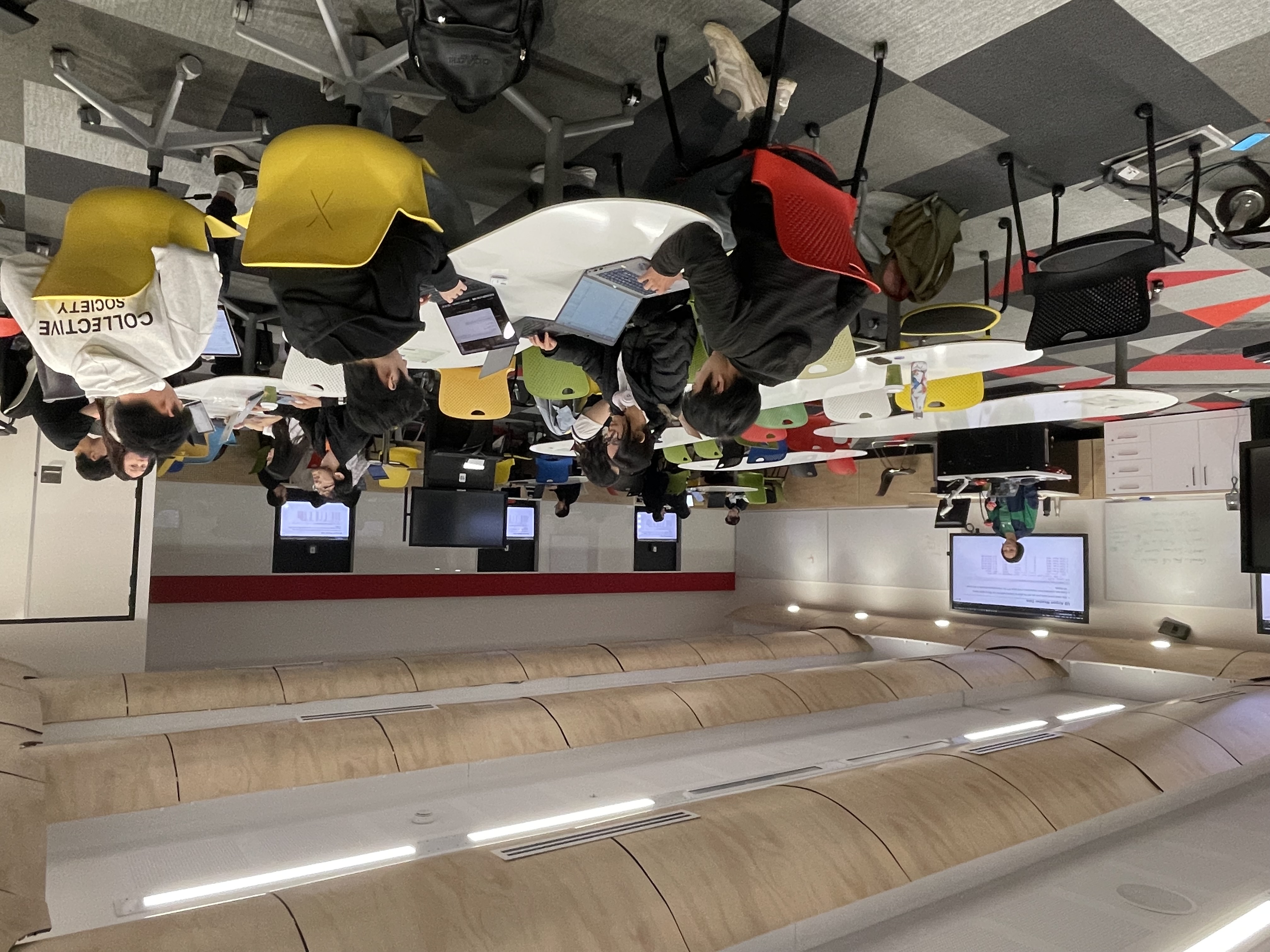
Over two fully catered days on 28 & 29 September 2026, you’ll dive into hands-on masterclass to learn how to create dashboards with Quarto and Shiny.
We assume you can already analyse and summarise your data in computational notebooks with R and/or Python. This masterclass will then enable you to share your insights or allow others to make their own conclusions in visually appealing dashboards.
For catering purposes, please register to the workshop when you register for DataViz 2026: https://mqedu.qualtrics.com/jfe/form/SV_beVCqnZj7OR7V6S.
You can find out more about this masterclass here.
In summary
Do not miss this opportunity to build your skills, add to your LinkedIn profile, collect some unique R hex stickers along the way, and make a difference. Register now for DataViz 2026!
Acknowledgement
This event is supported by the Faculty of Science & Engineering (FSE).
Iris Jiang and Thomas Fung
Organisers of DataViz